
Your brand just updated its primary blue. You search the codebase and find #1d6feb hardcoded in 12 separate files — component stylesheets, email templates, a React Native screen, an Android XML drawable. You update them one by one, miss two, and ship a release where the marketing banner and the checkout button are subtly different shades. That's the problem design tokens solve. Instead of scattering raw values across your codebase, you name every design decision once and reference it everywhere.
What Design Tokens Actually Are
A design token is a named variable that stores a single design decision — a value paired with an intent. The key distinction from CSS custom properties is that tokens are platform-agnostic. A CSS variable is already an output format — it only works in a browser. A design token is defined in JSON and can be transformed into CSS custom properties, Swift constants, Android XML resources, or SCSS variables from the same source of truth.
The W3C Design Tokens Community Group (DTCG) is standardising a JSON format for this. Each token uses $value for its stored value and $type to declare the data type. Here's a minimal example:
{
  "color": {
    "blue": {
      "500": {
        "$value": "#1d6feb",
        "$type": "color"
      }
    }
  }
}
Three token types build on each other: primitive (raw value, no semantic meaning), semantic (maps intent to a primitive), and component (scopes a semantic to one UI element).
A Three-Tier Token Hierarchy
Primitive Tokens (the palette)
Primitive tokens hold raw values with no opinion about where they're used. color.blue.500 is exactly #1d6feb — nothing more. These form the full vocabulary of your palette: every shade, every step of your spacing scale, every font size.
{
  "color": {
    "blue": {
      "100": { "$value": "#dbeafe", "$type": "color" },
      "300": { "$value": "#93c5fd", "$type": "color" },
      "500": { "$value": "#1d6feb", "$type": "color" },
      "700": { "$value": "#1d4ed8", "$type": "color" },
      "900": { "$value": "#1e3a8a", "$type": "color" }
    }
  }
}
No component should ever reference a primitive token directly. Primitives exist to be aliased — that's their only job.
Semantic Tokens (the intent)
Semantic tokens alias primitives and give them meaning. color.action.primary references color.blue.500 using DTCG's alias syntax:
{
  "color": {
    "action": {
      "primary": {
        "$value": "{color.blue.500}",
        "$type": "color"
      }
    },
    "surface": {
      "default": {
        "$value": "{color.neutral.50}",
        "$type": "color"
      }
    }
  }
}
When you rebrand from blue to indigo, you update one primitive alias. Every semantic token that referenced blue now resolves to indigo — zero component changes required.
Component Tokens (the scope)
Component tokens alias semantics and constrain them to one UI element. button.background references color.action.primary:
{
  "button": {
    "background": {
      "$value": "{color.action.primary}",
      "$type": "color"
    },
    "background-hover": {
      "$value": "{color.action.primary-hover}",
      "$type": "color"
    }
  }
}
Component tokens make per-component theming possible without touching global tokens. A white-label client can override button.background without affecting color.action.primary anywhere else.
Naming Conventions That Don't Break at Scale
The pattern that survives growth is [namespace].[category].[variant].[state]. For example: color.surface.default, color.surface.hover, color.text.disabled. The namespace anchors the domain, the category is the design property, the variant describes the visual role, and the state is optional but explicit.
The most important rule for the semantic layer: never use adjectives that describe appearance (dark, light, bright). Use intent instead (surface, on-surface, muted). A token called color.text.dark breaks immediately when you add a dark mode — the "dark" text token would need to be light. A token called color.text.primary works in both contexts.
On structure: nested JSON is easier to author; flat JSON is safer when running Style Dictionary transforms. Either works, but be consistent across your entire token file.
| Good naming | Common mistake | Why it breaks |
|---|---|---|
color.surface.default | color.white | Encodes appearance, not intent |
color.text.muted | color.gray.400 | Primitive leaking into semantic layer |
color.action.primary | color.blue | No variant — breaks when you add a secondary blue |
space.component.gap-sm | spacing-8 | Flat namespace, no category context |
From Figma Variables to CSS Custom Properties
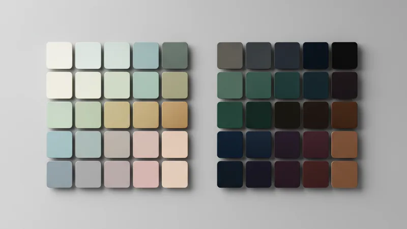
Figma Variables map cleanly onto token tiers: a Global collection holds primitive tokens, and a Theme collection holds semantic tokens. Modes within the Theme collection — "Light" and "Dark" — resolve the same semantic token to different primitive values. Toggle the mode and every frame updates at once.
The export path for most teams: Figma → Tokens Studio plugin (or the native Variables REST API) → DTCG-format JSON → CSS custom properties via Style Dictionary. For smaller teams, a manual export committed to the repo and run through Style Dictionary in CI works just as well. (See also shadcn/ui's recent Figma Kit update for a real-world example of how Figma Variables sync with CSS token output.)
After transformation, your CSS looks like this:
/* primitives */
:root {
  --color-blue-500: #1d6feb;
  --color-neutral-50: #f8fafc;
}

/* semantics — light mode */
:root {
  --color-action-primary: var(--color-blue-500);
  --color-surface-default: var(--color-neutral-50);
}

/* semantics — dark mode */
[data-theme="dark"] {
  --color-surface-default: var(--color-neutral-900);
}
Automating Token Delivery with Style Dictionary
Style Dictionary (by Amazon) takes your token JSON and outputs any format you need — CSS custom properties, SCSS, iOS Swift, Android XML — from a single config file. Two commands to get started:
npm install style-dictionary
npx style-dictionary build
The config file tells Style Dictionary where to find your tokens and what to emit:
{
  "source": ["tokens/**/*.json"],
  "platforms": {
    "css": {
      "transformGroup": "css",
      "buildPath": "dist/",
      "files": [
        {
          "destination": "tokens.css",
          "format": "css/variables"
        }
      ]
    },
    "ios": {
      "transformGroup": "ios-swift",
      "buildPath": "dist/ios/",
      "files": [
        {
          "destination": "Tokens.swift",
          "format": "ios-swift/class.swift"
        }
      ]
    }
  }
}
Style Dictionary v4+ natively understands the W3C DTCG format — $value and $type are parsed without any custom transforms. Commit the token JSON to your repo, run Style Dictionary in CI, and every platform gets updated output automatically on every merge.
Common Mistakes (and the Fix)
Skipping the semantic layer. Teams often alias components directly to primitives — button.background → color.blue.500. That's one fewer abstraction layer, and it feels faster to start. The cost arrives when you add dark mode: with no semantic layer, there's no clean place to swap values per theme.
Token explosion. A 4-page site does not need 400 tokens. The rule: if no component currently references a token, it shouldn't exist yet. Create tokens on demand, not speculatively.
Inconsistent naming across files. color.primary in one file and brand.primary in another break your Style Dictionary output and confuse every developer who touches the files. Enforce structure with a JSON Schema or the Style Dictionary validator — both catch naming violations before they reach CI.
Not versioning tokens. Token JSON is code. Renaming color.action.primary to color.cta.primary is a breaking change for every consumer of your design system. Treat renames as semver major bumps and communicate them in a changelog.
Frequently Asked Questions
What is the difference between a design token and a CSS custom property?
A design token is a platform-agnostic named design decision stored in JSON. A CSS custom property is one of its output formats. The same token can also output to Swift constants, Android XML, or SCSS variables — CSS is just one target.
How do design tokens enable dark mode?
By adding a semantic layer. Semantic tokens like color.surface.default alias to different primitive values in each mode — for example #ffffff in light and #121212 in dark. Components reference only the semantic token, so switching modes swaps all values at once without touching component code.
What is the W3C DTCG format?
The Design Tokens Community Group (DTCG) is a W3C group developing a standard JSON format for design tokens. Each token uses $value for its value and $type (e.g., color, dimension, fontFamily) for its data type. Style Dictionary v4+ natively parses this format.
How many design tokens is too many?
If no component currently references a token, it shouldn't exist yet. Most medium-sized systems work well with 30–60 semantic tokens plus a primitive palette. Audit unused tokens regularly — token bloat creates maintenance overhead without design benefit.
Design tokens are most valuable not when you're building a design system from scratch, but when that system needs to change — a rebrand, a new theme, a new platform. The three-tier hierarchy gives you a change surface that's precisely as wide as you need it to be. One primitive update propagates everywhere. One mode switch flips the entire visual theme. That's the promise, and with Style Dictionary and Figma Variables, it's fully achievable today.